Work
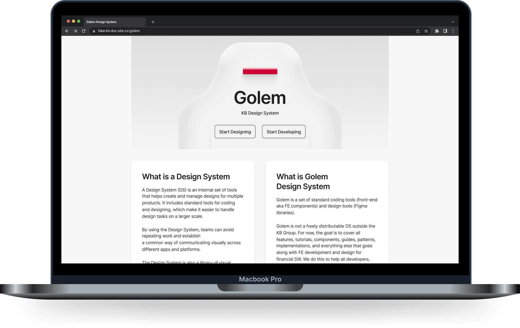
Golem Design System
State of the Art Design System for the New Era of Banking
Target 1/3
How can we develop a set of sustainable and adaptable components for a new daily banking app across iOS, Android, and Web platforms, considering that the final visual style is not yet determined?
My role 2/3
The gist of it
After multiple attempts by other experts, I spearheaded the organization-wide initiative that resulted in the successful first release. Throughout this process, we established standardized methods of operation and governance for design systems across the entire corporation.
More details
We initiated the process by examining existing design systems and libraries. Our initial findings included a component library designed for the previous banking system, created in Sketch and integrated with technical documentation in Confluence. Additionally, we were aware of an emerging library for the key aspects of web banking. As our research progressed, we uncovered smaller initiatives, such as those focused on internal applications or individuals experimenting with new tools to create libraries.
The introduction of new sales channels necessitated an entirely new backend, frontend, and design stack. Capitalizing on this opportunity, we began outlining the essential set of components: forms, buttons, straightforward illustrations, and templates. These served as valuable artifacts for discussions with developers, analysts, and the visual design aspects of the project.
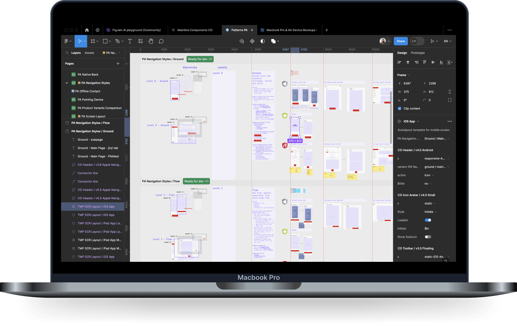
Subsequently, we generated initial mockups of uncomplicated workflows expected in the new channels, such as login, onboarding, and the selection of account numbers or card ordering. These fundamental screens, already identified as essential, became the basis for iterative refinement of the component setup, parameters, APIs, and implementations across all three supported platforms (iOS, Android, and Angular for web).
Simultaneously, we established small design system teams to manage this new internal product. Leveraging existing developers and UI designers, we formalized roles for platform–specific design leaders and introduced UX designers specializing in design systems. Subsequently, we expanded the team by including copywriters and a dedicated manager overseeing the project.

Artifacts 3/3
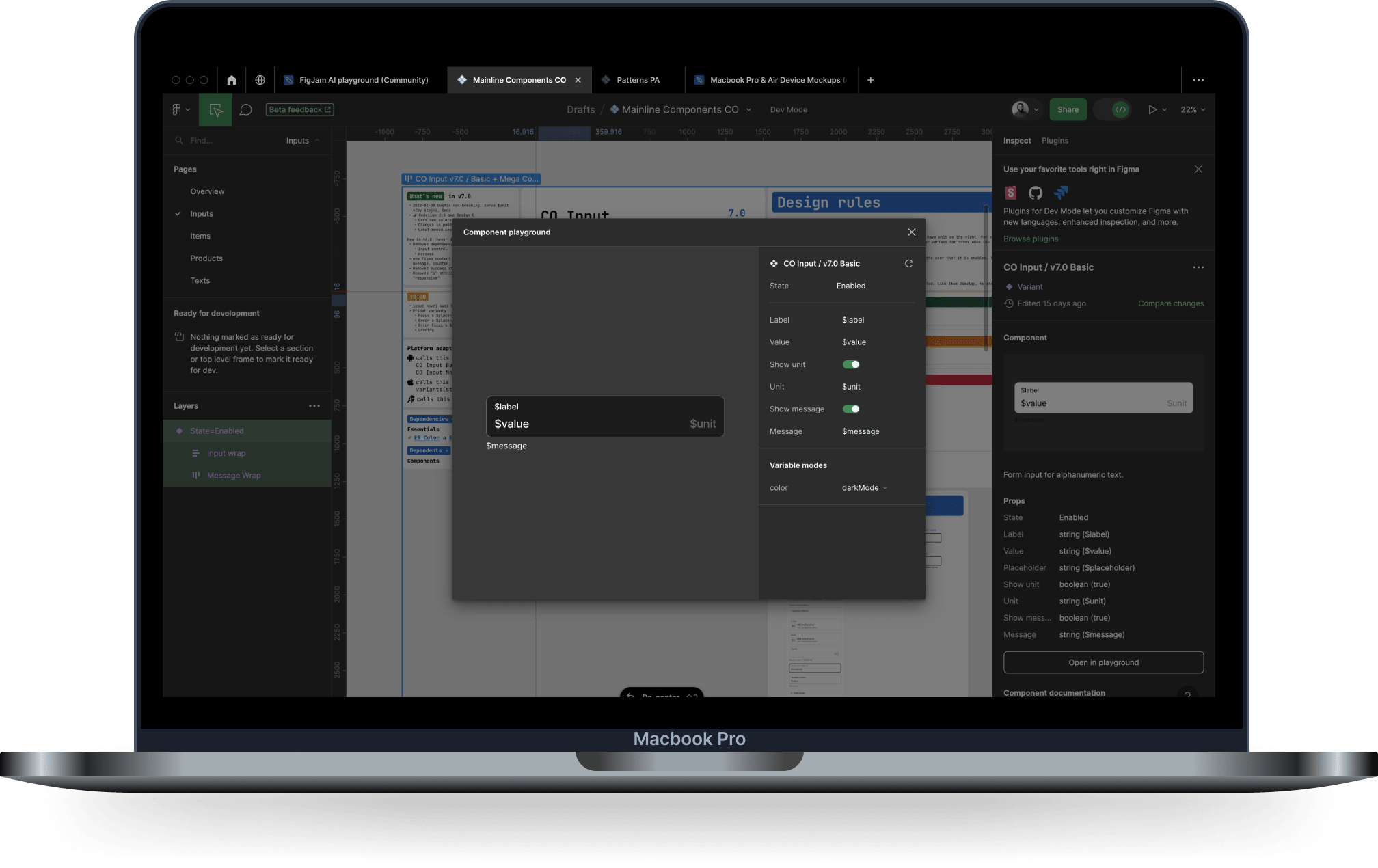
- Developed a library of 50 stable cross-platform interactive components in Figma. Each component showcases all interaction states and includes comprehensive documentation on the same Figma page. Utilizes the latest available Figma DS–management features.
- Created extensive technical documentation. Housed in Confluence, it features numerous examples, real–life use cases, production code, and API and integration-related details.
- Designed three showcase apps, each tailored for a specific platform, featuring interactive components. Visual regression testing is operational for one app, with plans underway for the remaining two.
- Implemented governance processes, including integration workflows and the establishment of a council to guide contribution proposals.
- Developed interactive Figma files for design onboarding, complementing existing resources for developers. These files seamlessly link to the developers' onboarding for a cohesive experience.