Work
Old enterprise sw got bloated, so we redesigned it
Problem 1/4
How can we redesign
heo for managers, so they are incentived to lead their companies more
effectively?
&
How can we redesign
heo for operators to perform their daily routines more effectively?
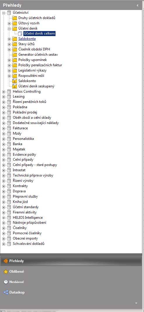
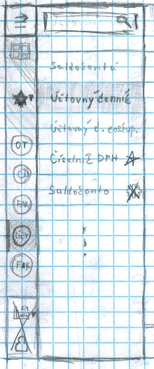
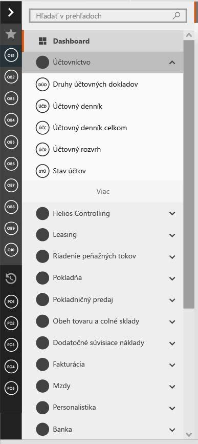
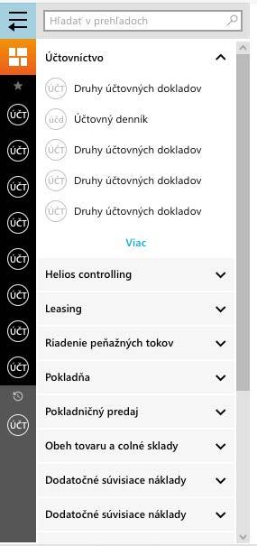
Process of redesigning one of the interface elements

Barriers 2/4
The
goal of this project was to redesign an
erp software package to make it attractive to potential customers,
while making it easy to use for
current users. While the application is robust and reliable, its interface has become bloated and hard
to
use over the years.
Another challenge was that on this redesign a much bigger design change, in the corporation itself,
was to
be evaluated. So the project team had to take into account the whole portfolio, which consisted of a
bunch
of different software suites.
Process 3/4
- Stakeholder Analysis
- Business Model Canvas
- Target Audience Identification
- Partnership Model
- Usability Field Studies
- Usability Testing with 6 humans
- Co–design workshops with corporate stakeholders
- Heuristic Evaluation
- Prototyping
- Wireflows
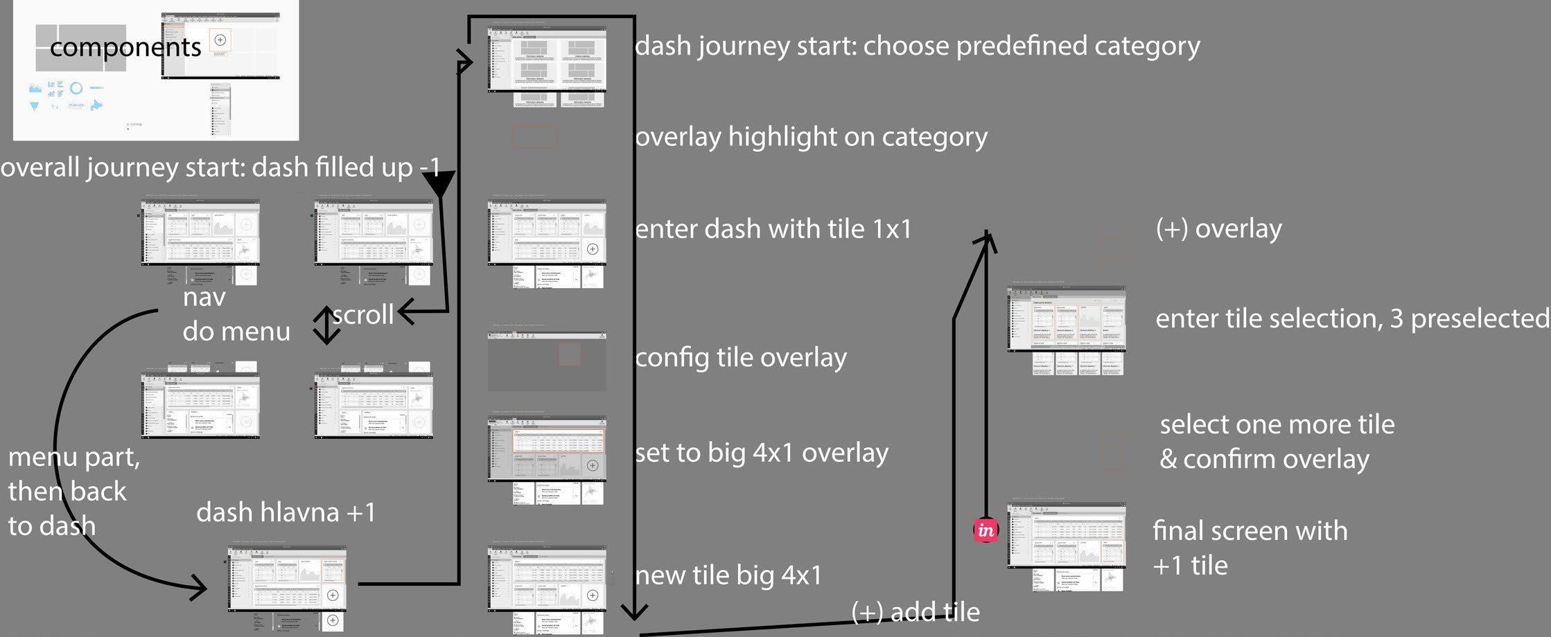
Result 4/4
The obvious solution was (Microsoft Office's) the Ribbon. So at the agency we conducted research, designed prototypes and tested it all. We also added the Dashboard to provide an overview of the most important views each user needs.
Client: cee leader in sme erps (confidential)
Location: CZ + SK
Project length: 1 year (participated 4 months)